Pleasing Android Layouts
Pleasing Android Layouts
satya - Sunday, September 13, 2009 1:07:23 PM
pleasing android layout xml samples
pleasing android layout xml samples
satya - Sunday, September 13, 2009 1:09:24 PM
android sample layouts
android sample layouts
satya - Sunday, September 13, 2009 1:11:12 PM
start at the begining, introduction to layouts
satya - Sunday, September 13, 2009 1:22:47 PM
xml tags for any basic view
satya - Sunday, September 13, 2009 1:23:13 PM
android border setting view
android border setting view
satya - Sunday, September 13, 2009 1:25:46 PM
see this developer thread
satya - Monday, September 14, 2009 10:24:27 AM
You can set a shape as the background of a layout. ex shape
<shape xmlns:android="http://schemas.android.com/apk/res/android">
    <stroke android:width="4dp" android:color="#FF00FF00" />
    <padding android:left="7dp" android:top="7dp"
            android:right="7dp" android:bottom="7dp" />
    <corners android:radius="4dp" />
</shape>
satya - Monday, September 14, 2009 10:30:09 AM
Here are some samples from the Android API samples
Here are some samples from the Android API samples
satya - Monday, September 14, 2009 10:30:31 AM
shape 1
<shape xmlns:android="http://schemas.android.com/apk/res/android">
    <solid android:color="#00000000"/>
    <stroke android:width="2dp" android:color="#ff000000"/>
    <padding android:left="1dp" android:top="1dp"
            android:right="1dp" android:bottom="1dp" />
</shape>
satya - Monday, September 14, 2009 10:32:01 AM
shape_2.xml
<shape xmlns:android="http://schemas.android.com/apk/res/android">
    <solid android:color="#FF0000FF"/>
    <stroke android:width="4dp" android:color="#FFFFFFFF"
            android:dashWidth="1dp" android:dashGap="2dp" />
    <padding android:left="7dp" android:top="7dp"
            android:right="7dp" android:bottom="7dp" />
    <corners android:radius="4dp" />
</shape>
satya - Monday, September 14, 2009 10:32:37 AM
shape_3.xml
<shape xmlns:android="http://schemas.android.com/apk/res/android" android:shape="oval">
    <solid android:color="#00000000"/>
    <stroke android:width="4dp" android:color="#99000000"
            android:dashWidth="4dp" android:dashGap="2dp" />
    <padding android:left="7dp" android:top="7dp"
            android:right="7dp" android:bottom="7dp" />
    <corners android:radius="4dp" />
</shape>
satya - Monday, September 14, 2009 10:33:02 AM
shape_4.xml
<shape xmlns:android="http://schemas.android.com/apk/res/android" android:shape="line">
    <stroke android:width="1dp" android:color="#FF000000"
            android:dashWidth="1dp" android:dashGap="2dp" />
</shape>
satya - Monday, September 14, 2009 10:33:29 AM
shape_5.xml
<shape xmlns:android="http://schemas.android.com/apk/res/android" android:shape="rectangle">
    <gradient android:startColor="#FFFF0000" android:endColor="#80FF00FF"
            android:angle="270"/>
    <padding android:left="7dp" android:top="7dp"
            android:right="7dp" android:bottom="7dp" />
    <corners android:radius="8dp" />
</shape>
satya - Friday, September 18, 2009 5:28:07 PM
Here are possible options for a textview
satya - Friday, September 18, 2009 5:28:36 PM
Here is aligning a text view
satya - Friday, September 18, 2009 5:30:45 PM
possible values for android:gravity
top
bottom
left
right
center_vertical
center_horizontal
fill_horizontal
center
fill
clip_vertical
clip_horizontal
satya - Friday, September 18, 2009 5:34:47 PM
A discussion on text size, sp, dp etc
satya - Monday, September 21, 2009 6:17:20 PM
android layout view percentage width
android layout view percentage width
satya - Monday, September 21, 2009 6:17:43 PM
See this discussion where it uses the layout_weight
satya - Monday, September 21, 2009 6:19:10 PM
Reference to View based XML defs
satya - Monday, September 21, 2009 6:21:04 PM
android layout_weight
android layout_weight
satya - Monday, September 21, 2009 6:22:18 PM
Here are some visual examples
satya - Monday, September 21, 2009 6:46:00 PM
Here is an example
<?xml version="1.0" encoding="utf-8"?>
<LinearLayout xmlns:android="http://schemas.android.com/apk/res/android"
	android:id="@+id/root_layout_id"
    android:orientation="vertical"
    android:layout_width="fill_parent"
    android:layout_height="fill_parent"
    android:background="@drawable/shape1"
    >
<TextView
	android:id="@+id/text1"
    android:layout_width="fill_parent"
    android:layout_height="wrap_content"
    android:text="Test view"
    />
<LinearLayout xmlns:android="http://schemas.android.com/apk/res/android"
	android:id="@+id/root_layout_id"
    android:orientation="horizontal"
    android:layout_width="fill_parent"
    android:layout_height="fill_parent"
    >
<TextView
    android:layout_width="wrap_content"
    android:layout_height="wrap_content"
    android:layout_weight="30"
    android:text="Test view L"
    android:background="#FFCC66"
    />
<TextView
    android:layout_width="wrap_content"
    android:layout_height="wrap_content"
    android:layout_weight="70"
    android:text="Test view R"
    android:background="#000099"
    />
</LinearLayout>
</LinearLayout>
satya - Tuesday, September 22, 2009 9:34:50 AM
linearlayout layout_height options
satya - Tuesday, September 22, 2009 10:00:22 AM
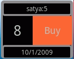
This is a pretty decent layout
<?xml version="1.0" encoding="utf-8"?>
<LinearLayout xmlns:android="http://schemas.android.com/apk/res/android"
    android:orientation="vertical"
    android:layout_width="150dp"
    android:layout_height="120dp"
    android:background="@drawable/box1"
    >
<TextView
	android:id="@+id/bdw_w_name"
    android:layout_width="fill_parent"
    android:layout_height="30dp"
    android:text="Anonymous"
    android:background="@drawable/box1"
    android:gravity="center"
    />
<LinearLayout xmlns:android="http://schemas.android.com/apk/res/android"
    android:orientation="horizontal"
    android:layout_width="fill_parent"
    android:layout_height="60dp"
    >
	<TextView
		android:id="@+id/bdw_w_days"
	    android:layout_width="wrap_content"
	    android:layout_height="fill_parent"
	    android:text="0"
	    android:gravity="center"
	    android:textSize="30sp"
	    android:layout_weight="50"
	    />
	<TextView
	   android:id="@+id/bdw_w_button_buy"
	    android:layout_width="wrap_content"
	    android:layout_height="fill_parent"
	    android:textSize="20sp"
	    android:text="Buy"
	    android:layout_weight="50"
	    android:background="#FF6633"
	    android:gravity="center"
	/>
</LinearLayout>
<TextView
	android:id="@+id/bdw_w_date"
    android:layout_width="fill_parent"
    android:layout_height="30dp"
    android:text="1/1/2000"
    android:background="@drawable/box1"
    android:gravity="center"
    />
</LinearLayout>
satya - Tuesday, September 22, 2009 2:51:59 PM
Here is how the above layout looks like
satya - Tuesday, September 22, 2009 2:52:55 PM
The box1 file is as follows
<shape xmlns:android="http://schemas.android.com/apk/res/android">
    <stroke android:width="4dp" android:color="#888888" />
    <padding android:left="2dp" android:top="2dp"
            android:right="2dp" android:bottom="2dp" />
    <corners android:radius="4dp" />
</shape>
satya - Monday, January 31, 2011 6:44:40 PM
You can use the base color from Android
<TextView android:id="@+id/textViewId"
    android:layout_width="fill_parent"
    android:layout_height="fill_parent"

    android:background="@android:color/white"

    android:text="@string/hello"
    />
But again you have only limited colors. You can check them out by doing
android.R.color.
Then eclipse will prompt what is out there. the set is very small. This could be useful to quickly try somethign. Otherwise you will need your own color set
satya - Monday, January 31, 2011 6:53:26 PM
Here is a way to control the text size
<TextView android:id="@+id/textViewId"
....
    android:textSize="@dimen/medium_size"
...
    />
satya - Monday, January 31, 2011 6:53:59 PM
Defining the dimension above
<resources>
    <string name="hello">Hello World</string>
    <dimen name="forty_pixels">40px</dimen>
    <dimen name="medium_size">100sp</dimen>
</resources>
satya - Thursday, February 03, 2011 11:03:27 AM
Not sure how legitimate this is: http://www.androidicons.com/
Not sure how legitimate this is: http://www.androidicons.com/
Just a reference. I have not verified this site for authenticity. Use it as you see fit.
satya - Friday, February 11, 2011 12:57:52 PM
Note on layoutparams
The dimension can be one of
?FILL_PARENT (renamed MATCH_PARENT in API Level 8 and higher), which means that the view wants to be as big as its parent (minus padding)
?WRAP_CONTENT, which means that the view wants to be just big enough to enclose its content (plus padding)
?an exact number
satya - Friday, February 11, 2011 1:04:51 PM
layout weight and gravity are properties of LinearLayout
gravity indicates alignment
weight Indicates how much of the extra space in the LinearLayout will be allocated to the view associated with these LayoutParams.
satya - Friday, February 11, 2011 1:05:46 PM
More on layout_weight
Indicates how much of the extra space in the LinearLayout will be allocated to the view associated with these LayoutParams. Specify 0 if the view should not be stretched. Otherwise the extra pixels will be pro-rated among all views whose weight is greater than 0.
satya - Saturday, March 05, 2011 10:42:23 AM
A vertical sandwich layout
header (fixed height)
  height:10
  weight:0

Body (Elastic)
  height:match_parent
  weight:1

footer (Fixed height)
  height:10
  weight:0
satya - Monday, November 07, 2011 10:53:31 AM
a resource file for you
<resources>
    <color name="black">#000000</color>
    <color name="red">#FF0000</color>
    <color name="white">#FFFFFF</color>
    <color name="gray">#C0C0C0</color>
    <color name="yellow">#FFFF00</color>
    <color name="blue">#0000FF</color>
    <color name="green">#00FF00</color>
</resources>
satya - Mon Aug 20 2012 13:51:00 GMT-0400 (Eastern Daylight Time)
Pleasures of relative layout
satya - Tue Aug 21 2012 13:02:52 GMT-0400 (Eastern Daylight Time)
Your layout filename can use an '_' (underscore) but not a '-' (dash)
Your layout filename can use an '_' (underscore) but not a '-' (dash)
satya - Tue Aug 21 2012 15:49:03 GMT-0400 (Eastern Daylight Time)
This seem to work for a 3 to 1 split of a screen
<LinearLayout xmlns:android="http://schemas.android.com/apk/res/android"
    android:orientation="vertical"
    android:layout_width="fill_parent"
    android:layout_height="fill_parent"
    >
<TextView  android:id="@+id/glViewId"
    android:layout_width="match_parent"

    android:layout_height="0sp"
    android:layout_weight="3"

    android:text="Place holder for GL"
    android:background="@drawable/shape2"
    />
<TextView  android:id="@+id/debugTextViewId"
    android:layout_width="match_parent"

    android:layout_height="0sp"
    android:layout_weight="1"

    android:background="@drawable/shape2"
    android:text="A Simple Main Activity. Click Menu to Proceed"
    />
</LinearLayout>
satya - Thu Nov 29 2012 21:16:43 GMT-0500 (Eastern Standard Time)
Stock icons and icon design guidelines from Android
satya - 3/16/2013 4:05:48 PM
In Android how to specify a text size relative to the default size?
In Android how to specify a text size relative to the default size?
Search for: In Android how to specify a text size relative to the default size?
satya - 3/16/2013 4:23:57 PM
Here is an example of a relative layout

satya - 3/16/2013 4:25:41 PM
B2 above needs to aligned to right and it is sufficient...
to say B1 is just left of B2. You dont need to say B1 is also aligned to the parent right. If you say it B1 and B2 will be overlapped.
satya - 3/17/2013 8:25:56 AM
Ok I give in: Relative layout quickref
android:layout_alignParentLeft
android:layout_alignParentRight
android:layout_alignParentTop
android:layout_alignParentBottom
android:layout_centerHorizontal
android:layout_centerVertical
android:layout_centerInParent
android:layout_toLeftOf
android:layout_toRightOf
android:layout_above
android:layout_below
satya - 3/17/2013 9:02:48 AM
I suppose you could do this for varying the textsize for contrast
android:textSize="@android:style/TextAppearance.Small"
satya - 3/17/2013 9:22:53 AM
That would be wrong: textSize can be only a dimension
That would be wrong: textSize can be only a dimension
satya - 3/17/2013 9:23:22 AM
So the right thing is
android:textAppearance="@android:style/TextAppearance.Small"
satya - 3/17/2013 9:25:30 AM
How to use Android style textAppearance?
How to use Android style textAppearance?
satya - 3/20/2013 11:36:17 AM
sp and dp
when you specify size in "dp" or "dip" (density independent pixels), Android will adjust the scaling to keep the size relatively the same. This means in a high density device it will take more pixels.
On the same device an "sp" (scalable pixels) will adjust to the level of magnification that the user wants.
Typically scalable graphics like "Text" uses "sp" as it won't loose clarity when scaled up or down.
satya - 4/10/2013 9:37:57 AM
Another vertical elastic multi-layered sandwich
header (fixed height)
  height:10dp
  weight:0

lead (fixed height)
  height:wrap_content
  weight:0

Body (Elastic)
  height:match_parent
  weight:1
  layout_margin:10dp; //if needed

footer (Fixed height)
  height:wrap_content
  weight:0

another footer (Fixed height)
  height:wrap_content
  weight:0
satya - 4/10/2013 9:41:52 AM
You may want to lead your layout files like this
<?xml version="1.0" encoding="utf-8"?>
<!--
*********************************************
* create_word_meaning.xml
* prefix: cwm_
* Create a word meaning
* Input controls:
*    word
*    details: created by, on
*     meaning text area
*    submit button
*********************************************
-->
The prefix will let you prefix your ids so that they don't conflict in the R.id namespace!!
satya - 4/10/2013 9:49:48 AM
Correspondingly in your activity top do this
/*
 * Given a word create a meaning for it.
 * uses layout: create_word_meaning (cwm_)
 */
satya - 11/9/2013 11:57:10 AM
You can make your activities a lighter theme
<activity android:name="com.androidbook.asynctask.TestProgressBarDriverActivity"
                  android:label="Test Progress bars"
                  android:theme="@android:style/Theme.Light"/>